
Hair Care E-commerce:
Designed to Convert
All personal data shown is fictional, for demonstration only. Any resemblance to real persons is coincidental.
-
Industries
- Retail and E-commerce
-
Company
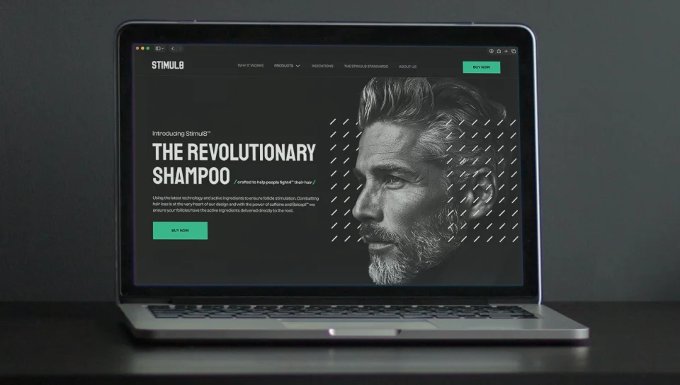
Our client is a British hair care brand that creates caffeine-based shampoo and conditioner for people dealing with thinning hair and early hair loss. The formula combines eight active botanical ingredients to support the scalp, strengthen hair from the root, and help reduce shedding - for both men and women. The brand sells through its own online store and on Amazon, so its story needs to stay clear and consistent wherever customers meet it.
-
what we did
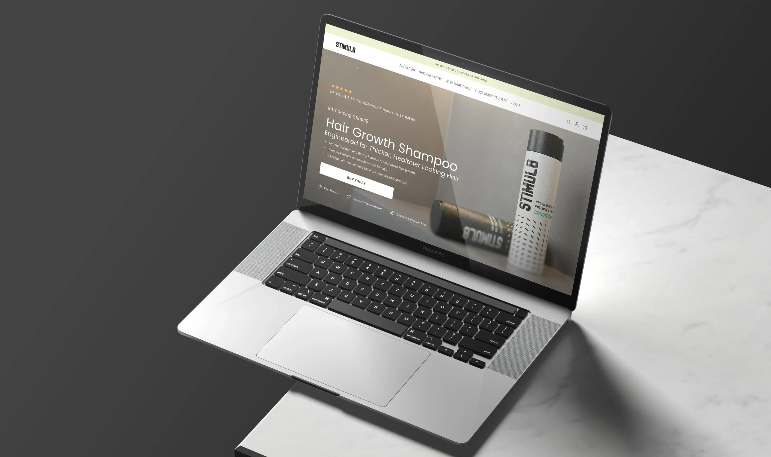
We created a conversion-focused website concept for the brand, along with product creatives for Amazon and a print ad. Every page was designed around one goal - guiding visitors from first interest to purchase through clear messaging, strong visuals, and well-placed calls to action.
- Conversion-driven structure - page flows built around the buying journey, from the first screen to the purchase block.
- Persuasive product storytelling - benefit-led copy, ingredient explanations, and comparisons that answer objections before they arise.
- Product page - a focused layout with key benefits, social proof, and purchase options in one view.
- Amazon creatives - A+ content and listing images designed to stand out in search and support the buying decision.
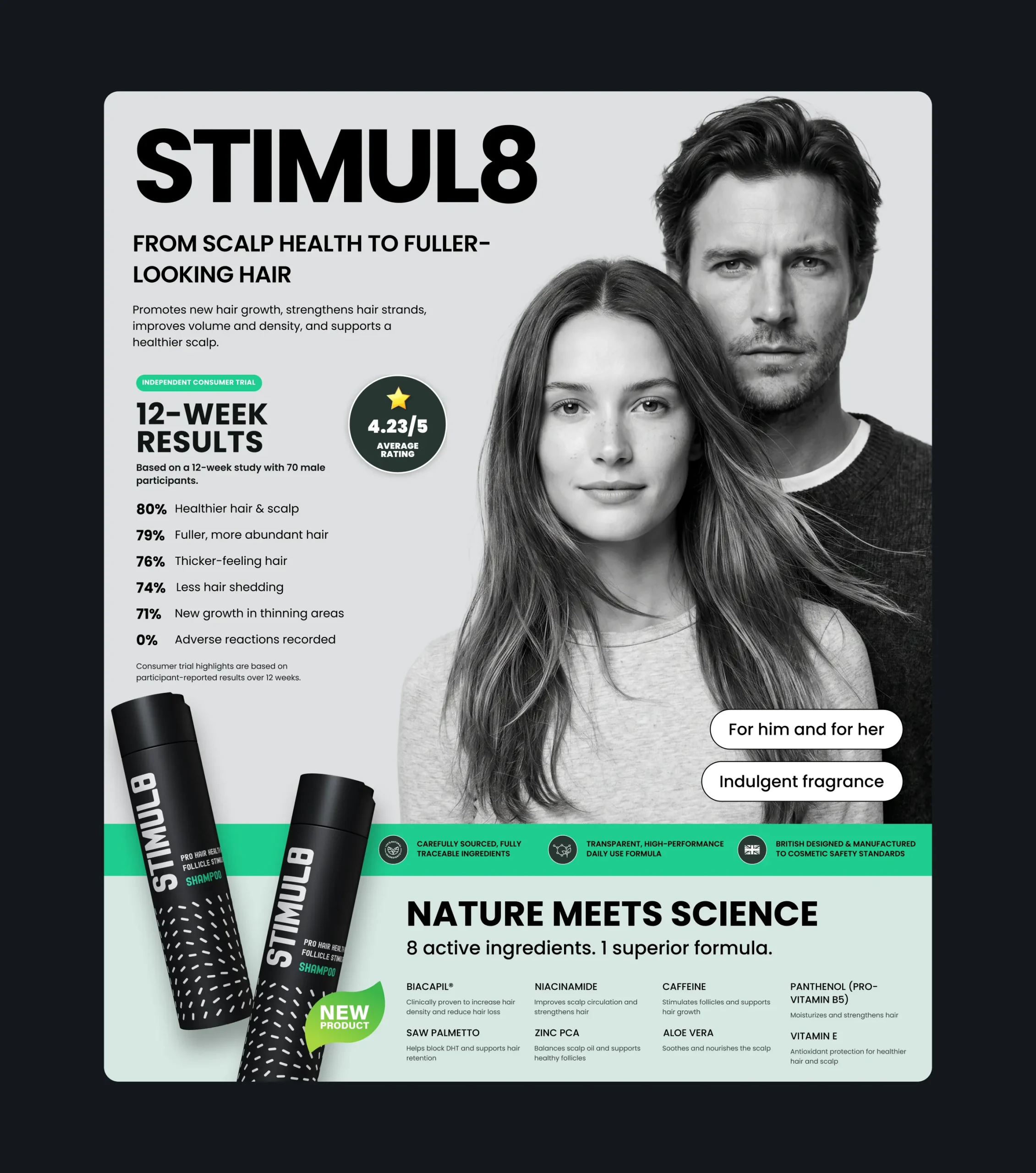
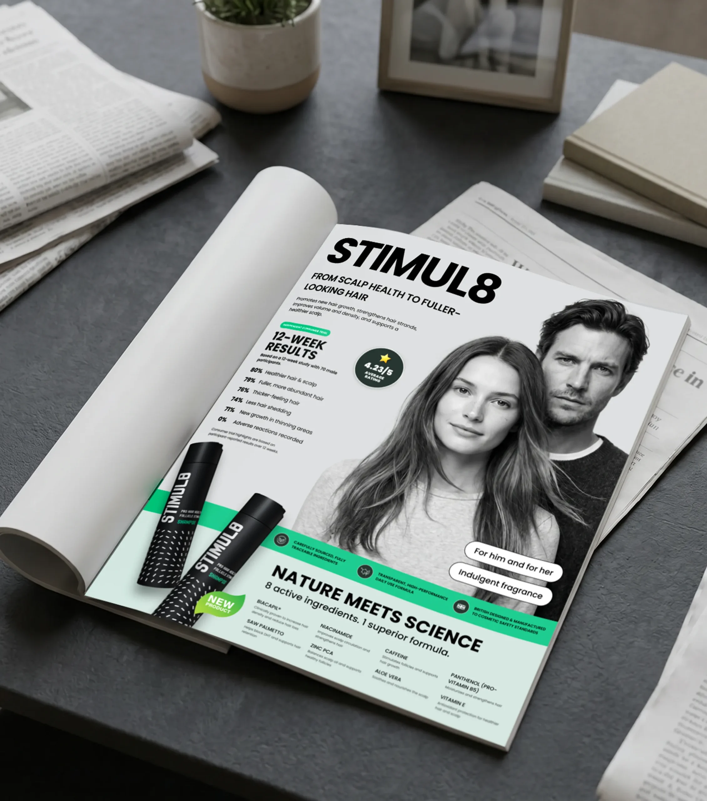
- Print advertising - a magazine ad that carries the same message and visual style offline.
- Responsive design - layouts adapted for mobile, where most shoppers browse and buy.
Challenges
-
01
Turning Interest into Purchases
The original store relied on a standard template that presented the product but did little to sell it. The challenge was to build a structure that guides visitors step by step toward a purchase while keeping the experience calm and trustworthy.
-
02
Making the Science Persuasive
Hair loss is a sensitive topic, and shoppers are cautious about products that promise results. The content needed to explain how the formula works in simple terms and back each claim with proof, turning hesitation into confidence.
-
03
Selling Across Channels
Customers meet the product on the website, on Amazon, and in print. Each channel needed visuals that capture attention quickly and deliver the same key message, so the brand stays recognizable and convincing wherever it appears.
Homepage Built to Convert
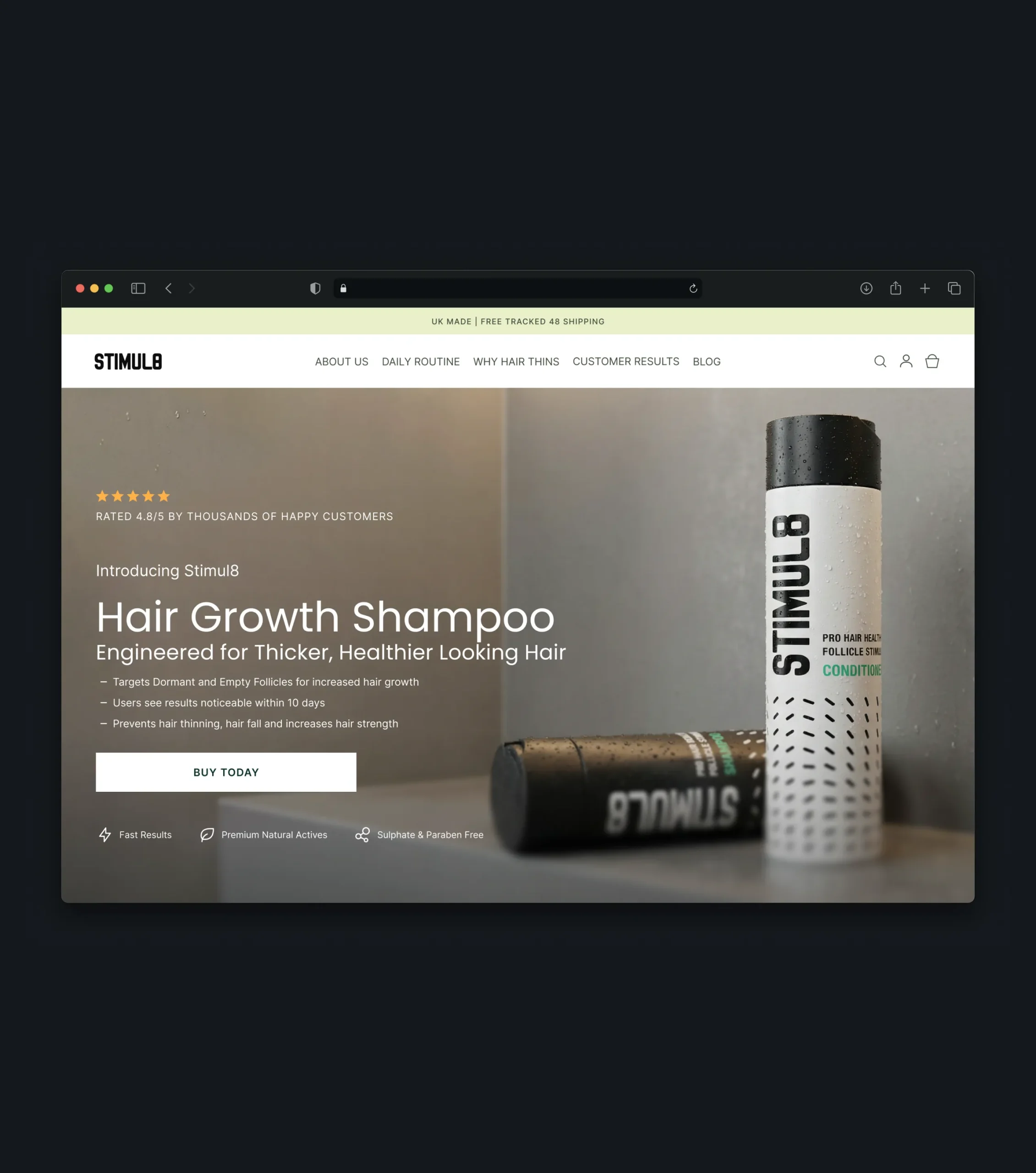
The homepage works as a landing page for the brand: it states the main promise, builds credibility early, and leads visitors toward the product without distractions. Every section moves the shopper one step closer to a decision, shortening the path from first visit to purchase.
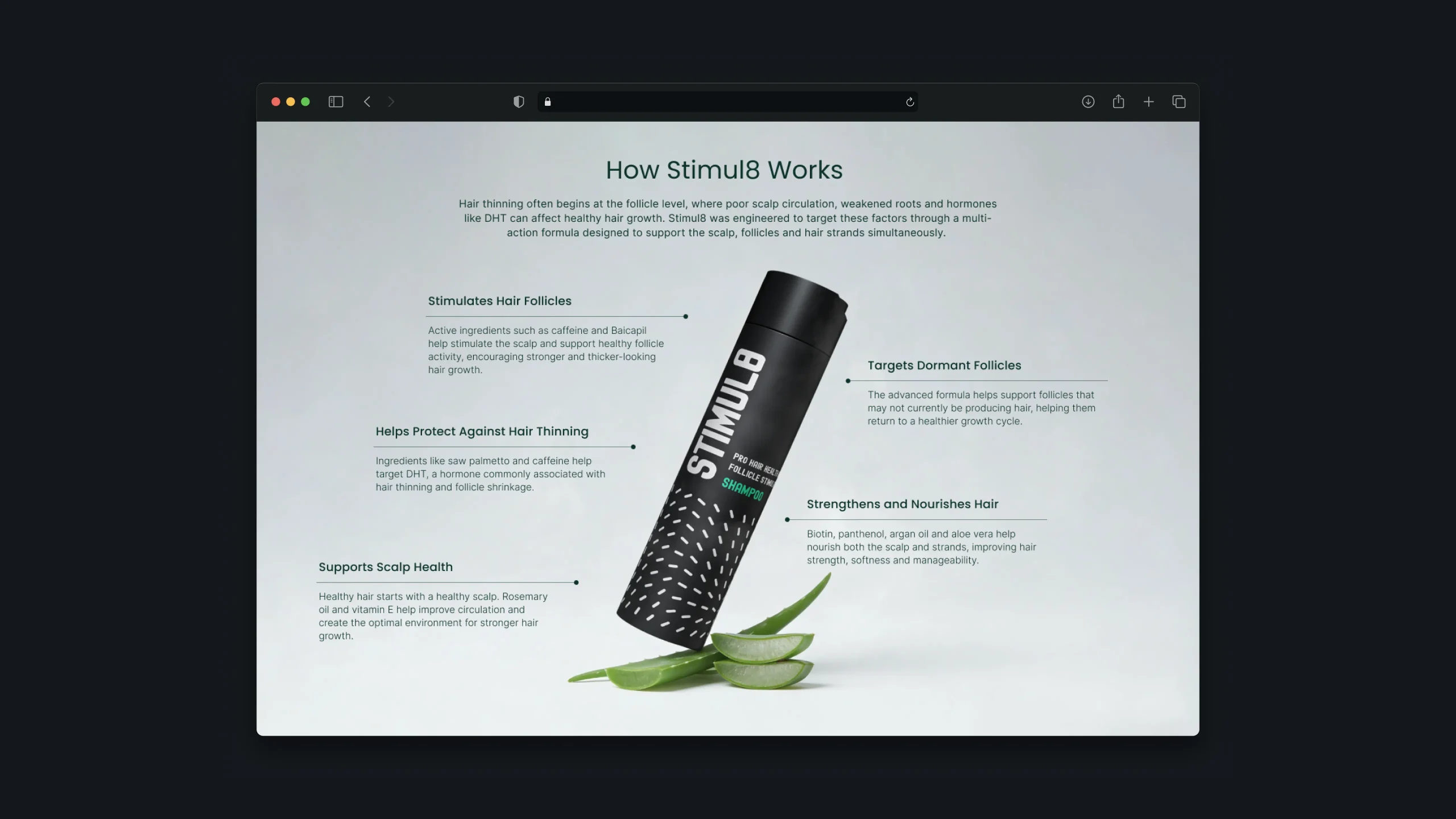
How It Works
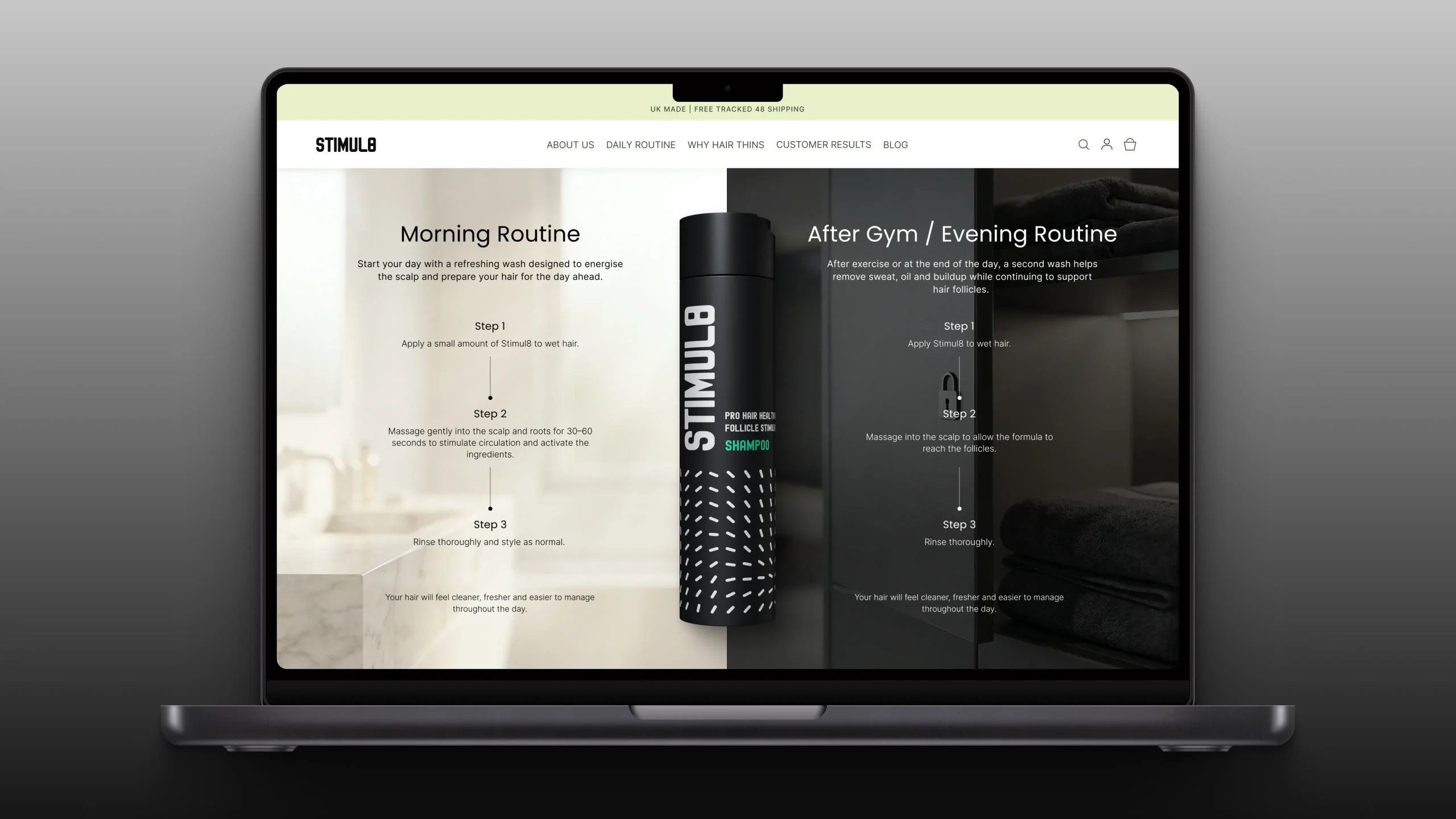
A clear explanation of how the formula works turns a complex product into an easy decision. By showing the mechanism behind the results, the page gives shoppers a rational reason to believe the product will work for them and reduces hesitation before purchase.
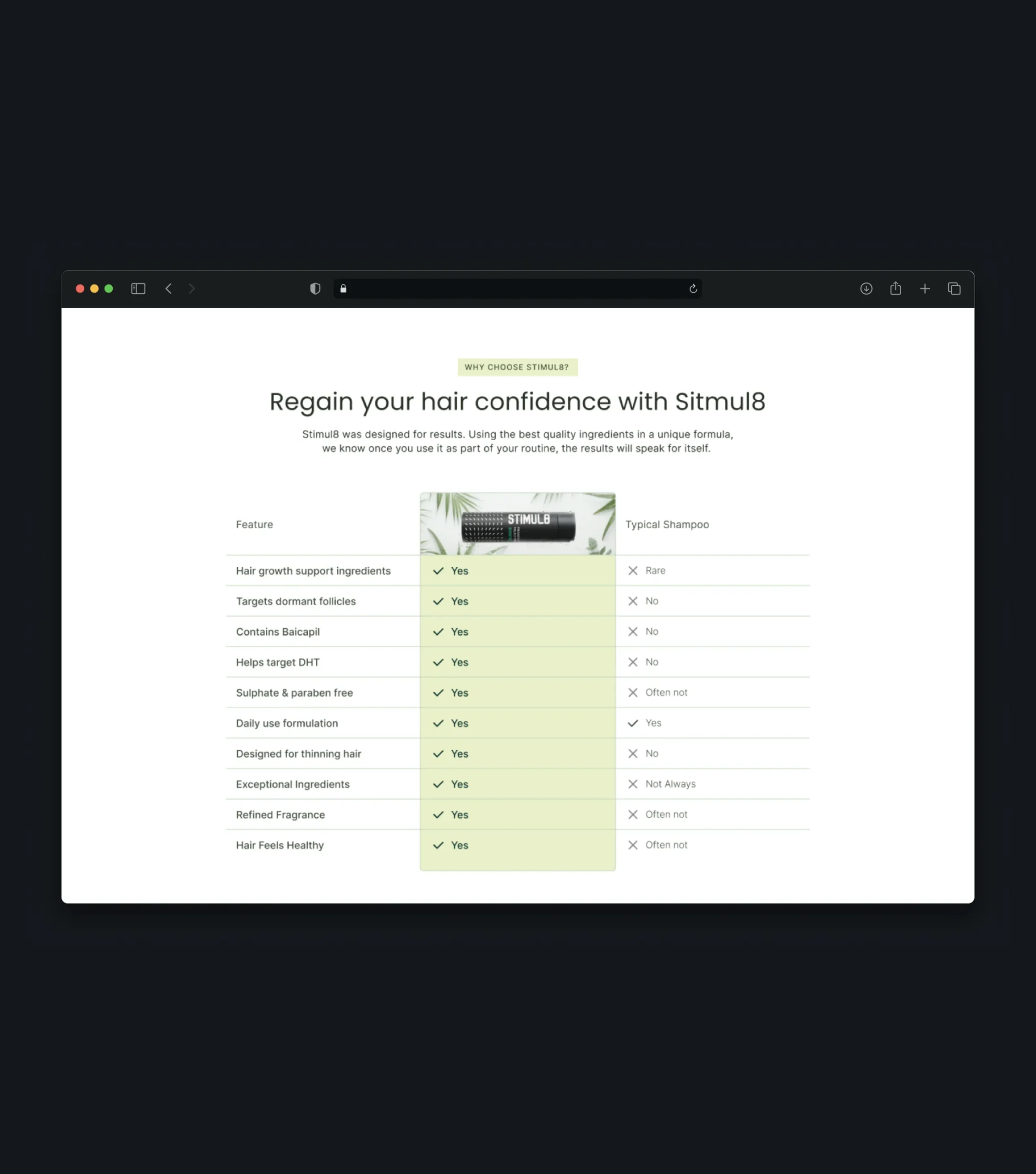
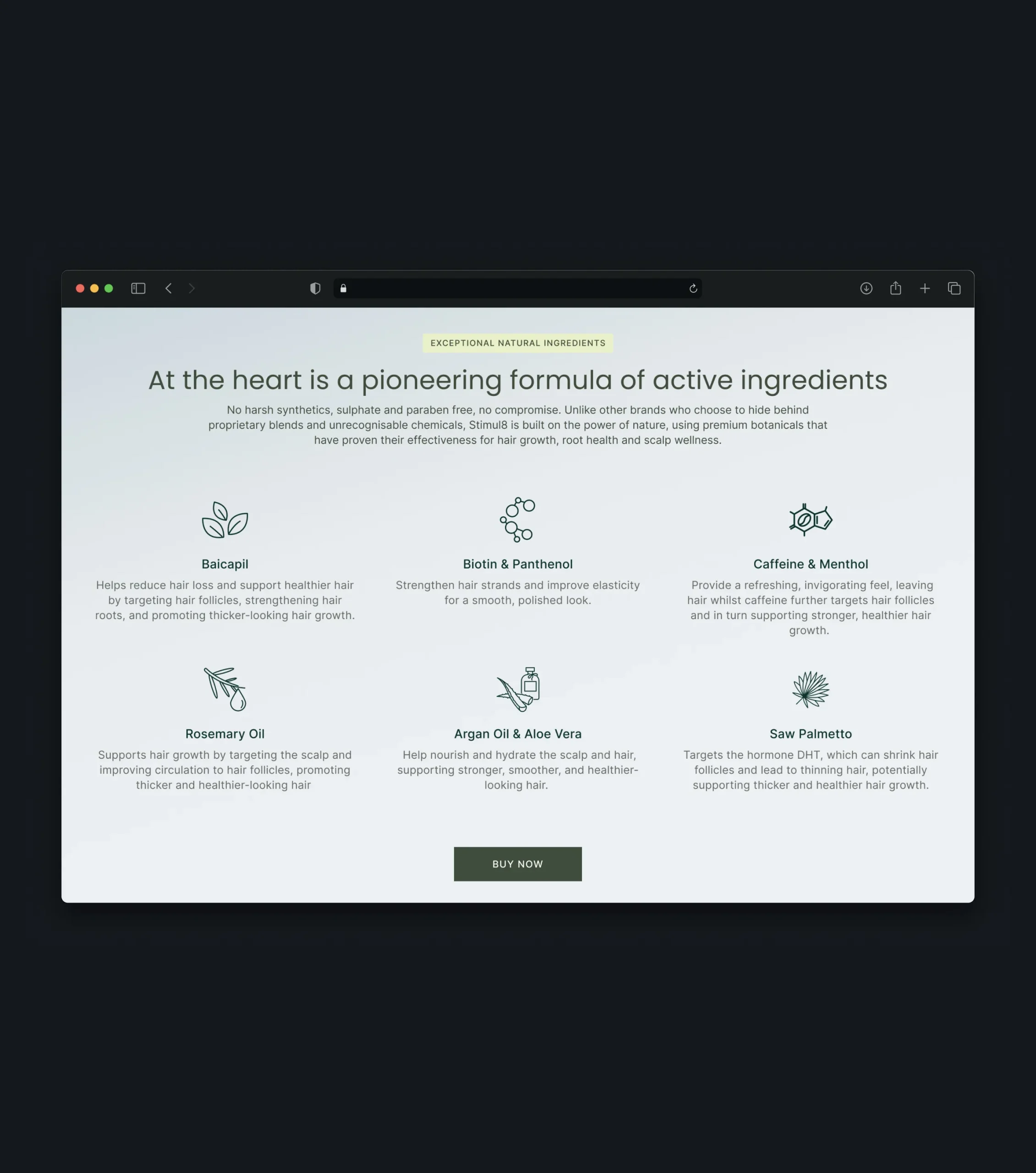
Ingredients & Comparison
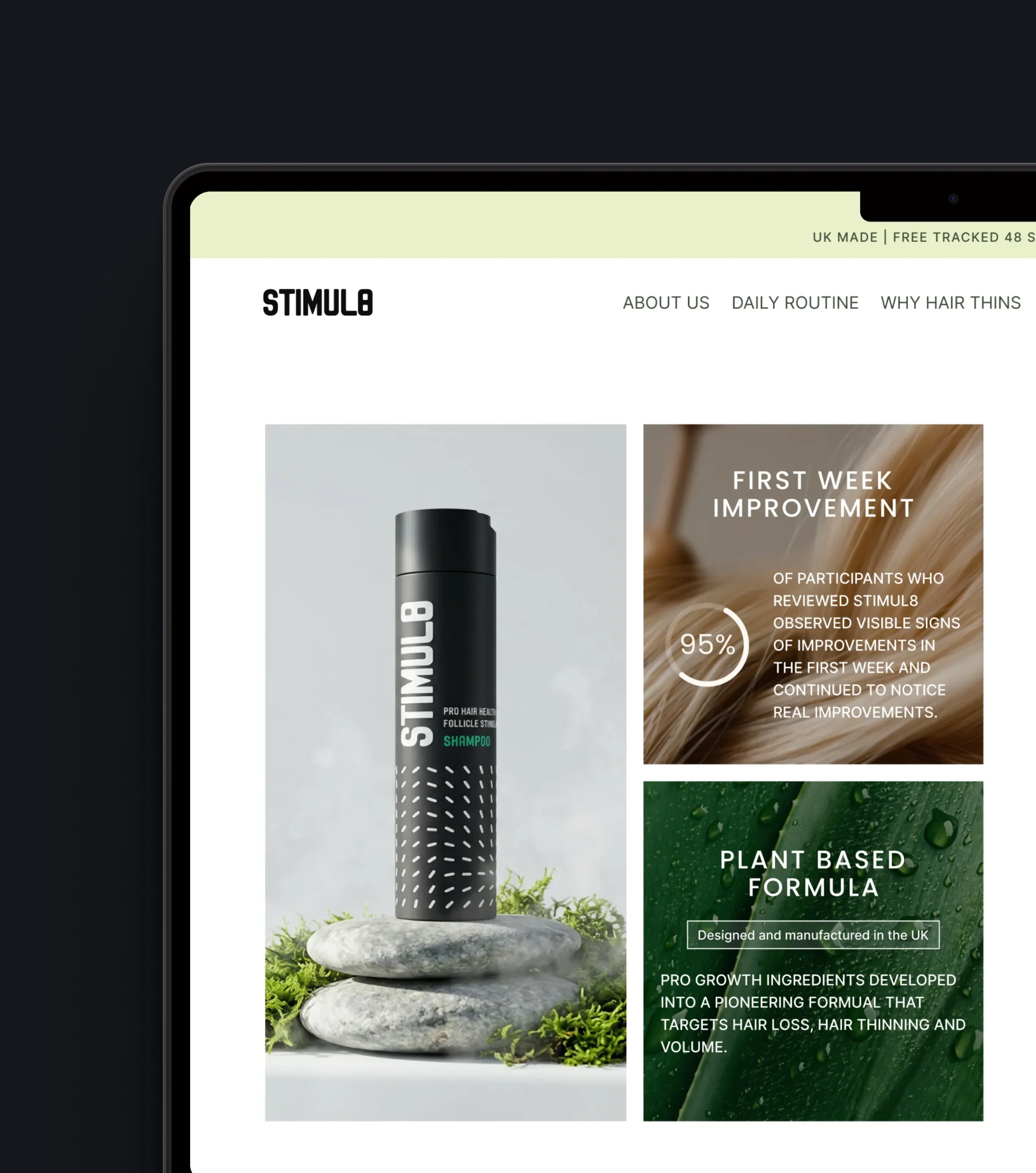
Transparent ingredients and a direct comparison with standard shampoos help shoppers justify a premium choice. Instead of asking customers to trust marketing claims, the page lets them see the difference for themselves, which strengthens confidence and supports the decision to buy.
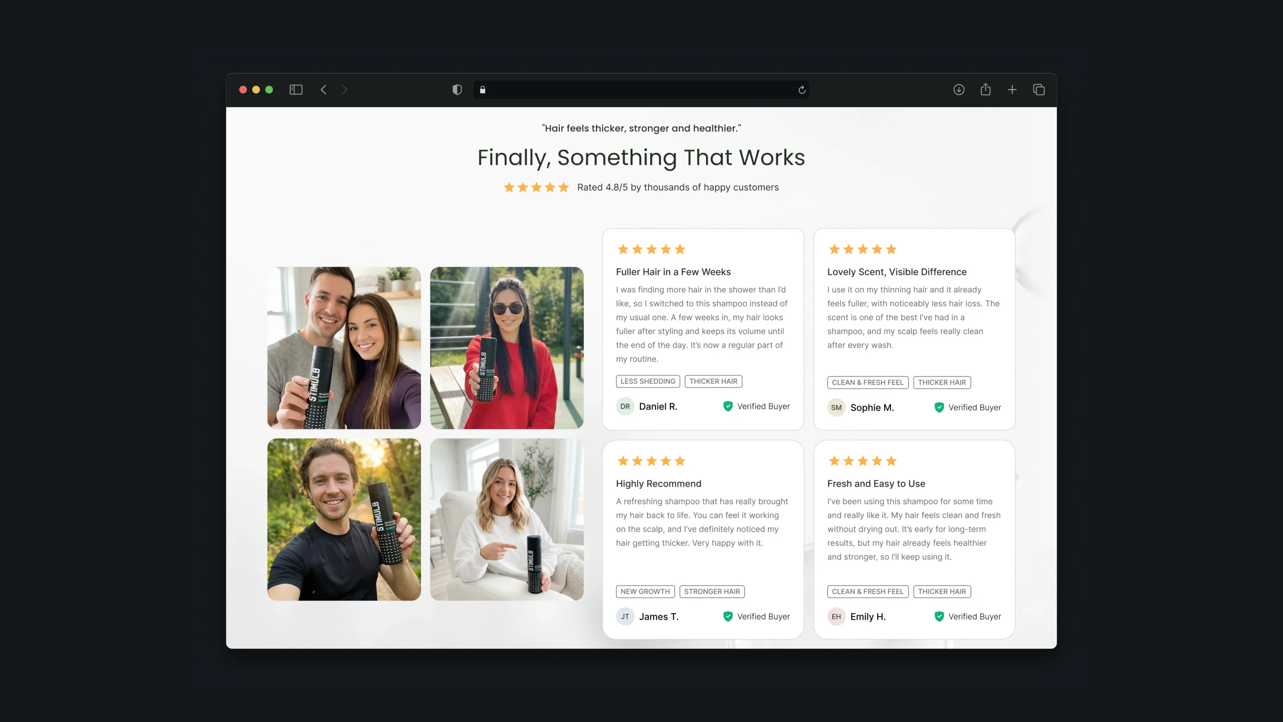
Reviews & Social Proof
Real customer experiences answer the question every new buyer has - does it actually work? Social proof placed at the moments of doubt turns other people’s results into reassurance and makes the first purchase feel less risky.
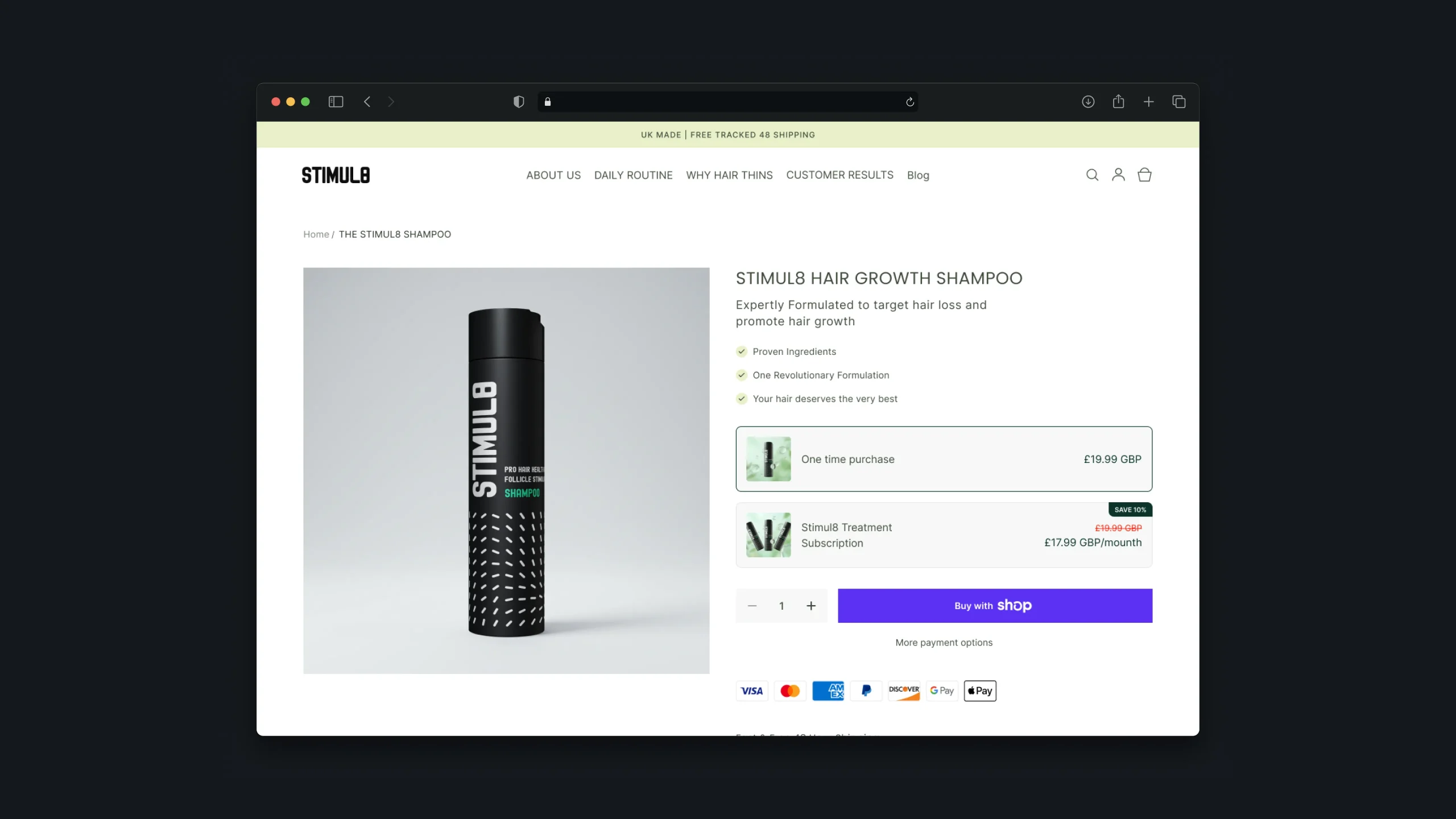
Product Page
The product page is built to close the sale. Everything a shopper needs to decide - benefits, proof, purchase options, and answers to common questions - is gathered in one place, so the decision can be made without leaving the page, while flexible purchase options encourage repeat orders.
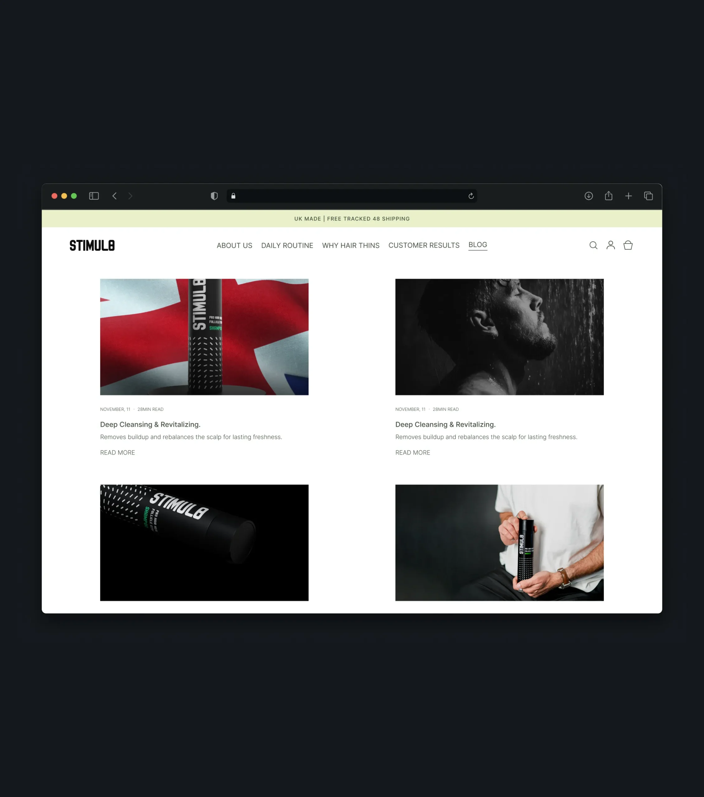
Educational Content & Blog
The educational content is designed to help visitors better understand their hair concerns and discover the product as a potential solution. It also creates opportunities for organic search visibility and helps engage shoppers who are still exploring their options.
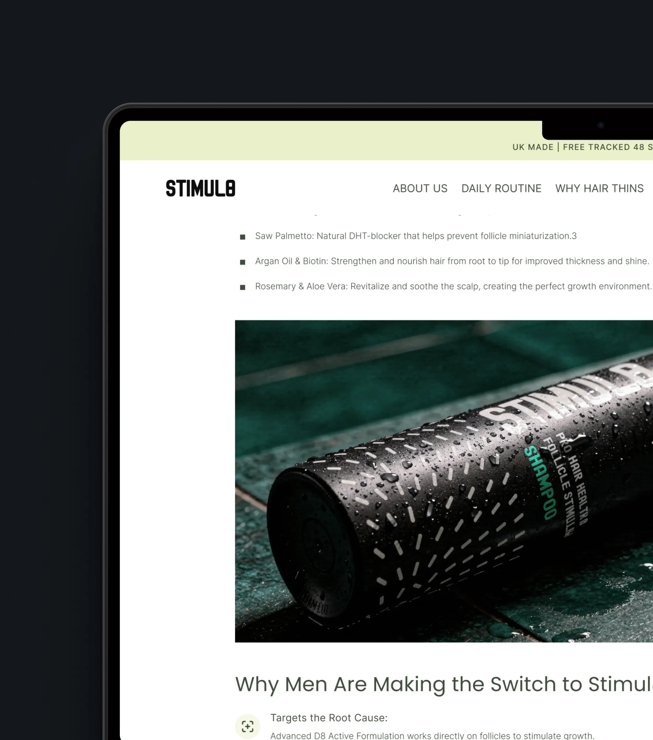
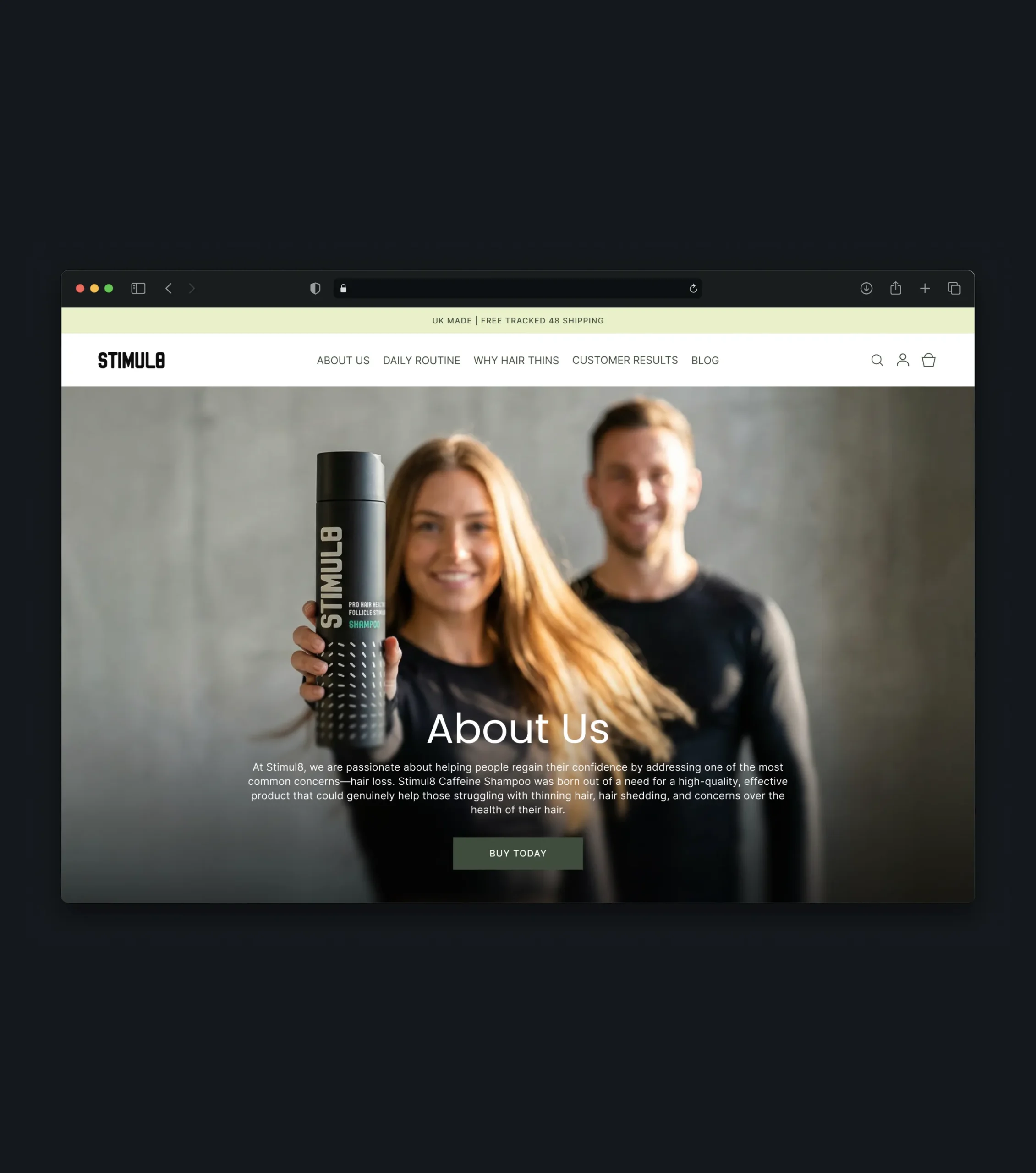
Brand Story & Quality Standards
For a new brand, credibility matters as much as the product itself. The brand story and quality standards show who stands behind the formula, removing one of the main barriers to trying an unfamiliar product.
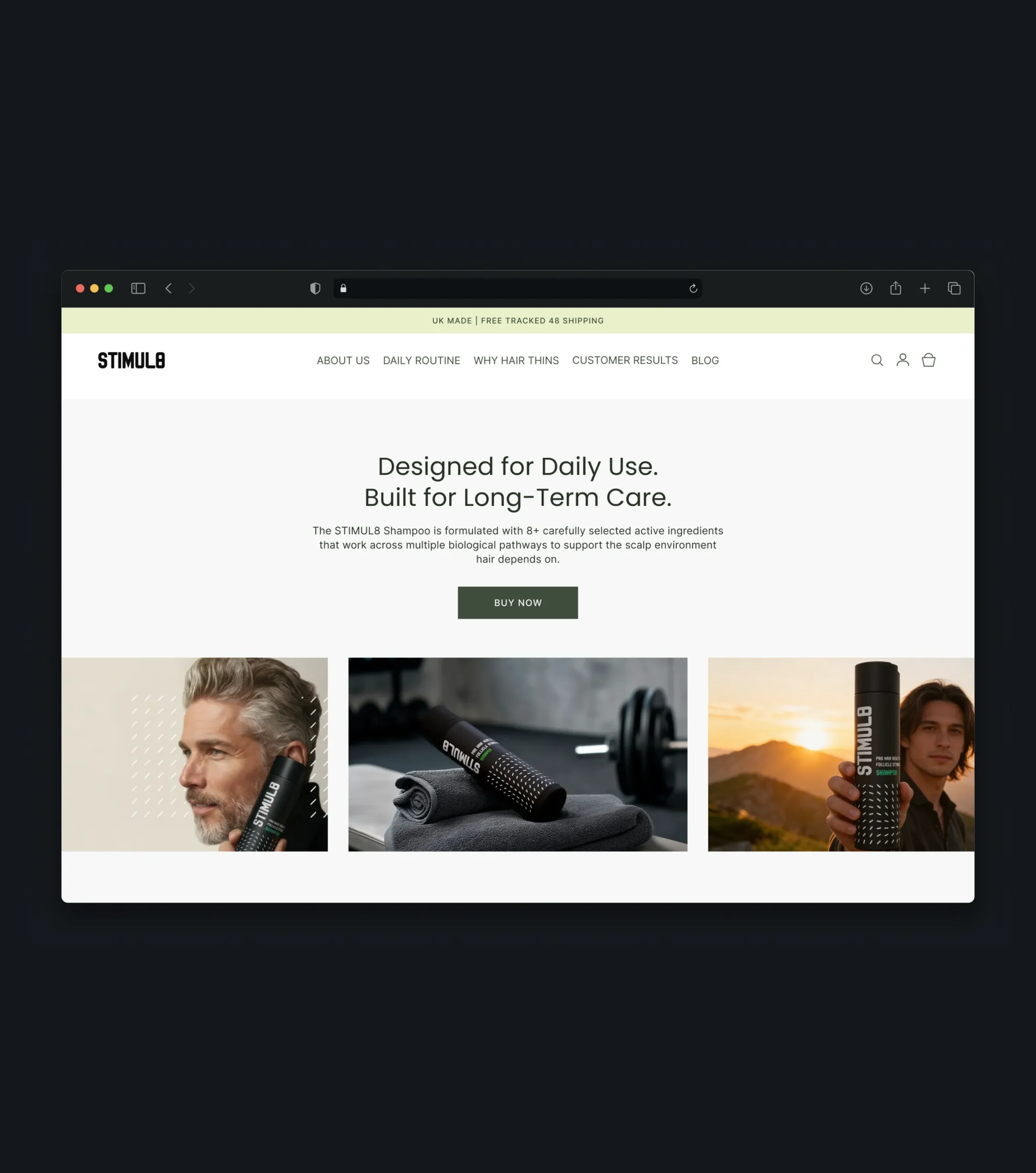
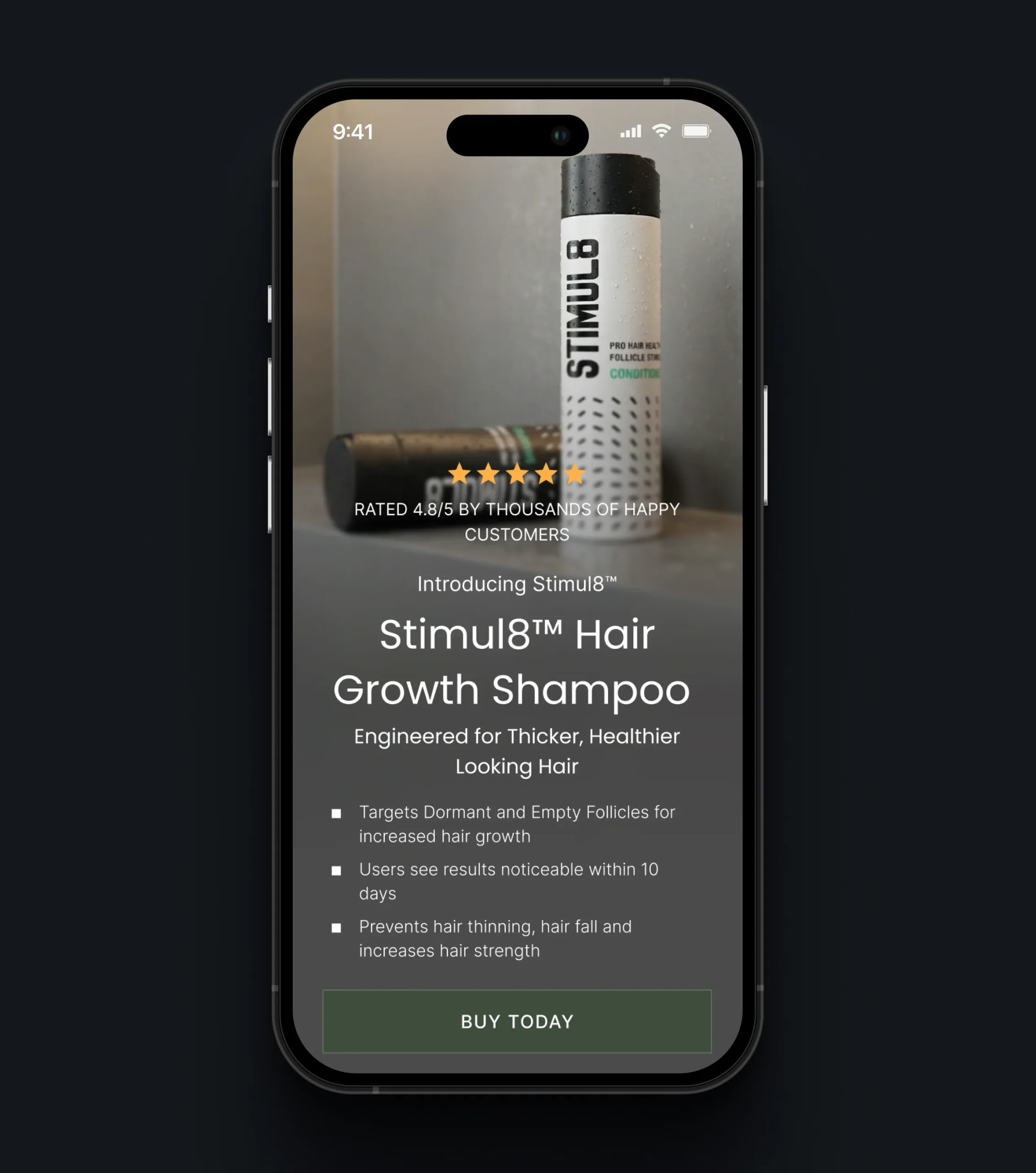
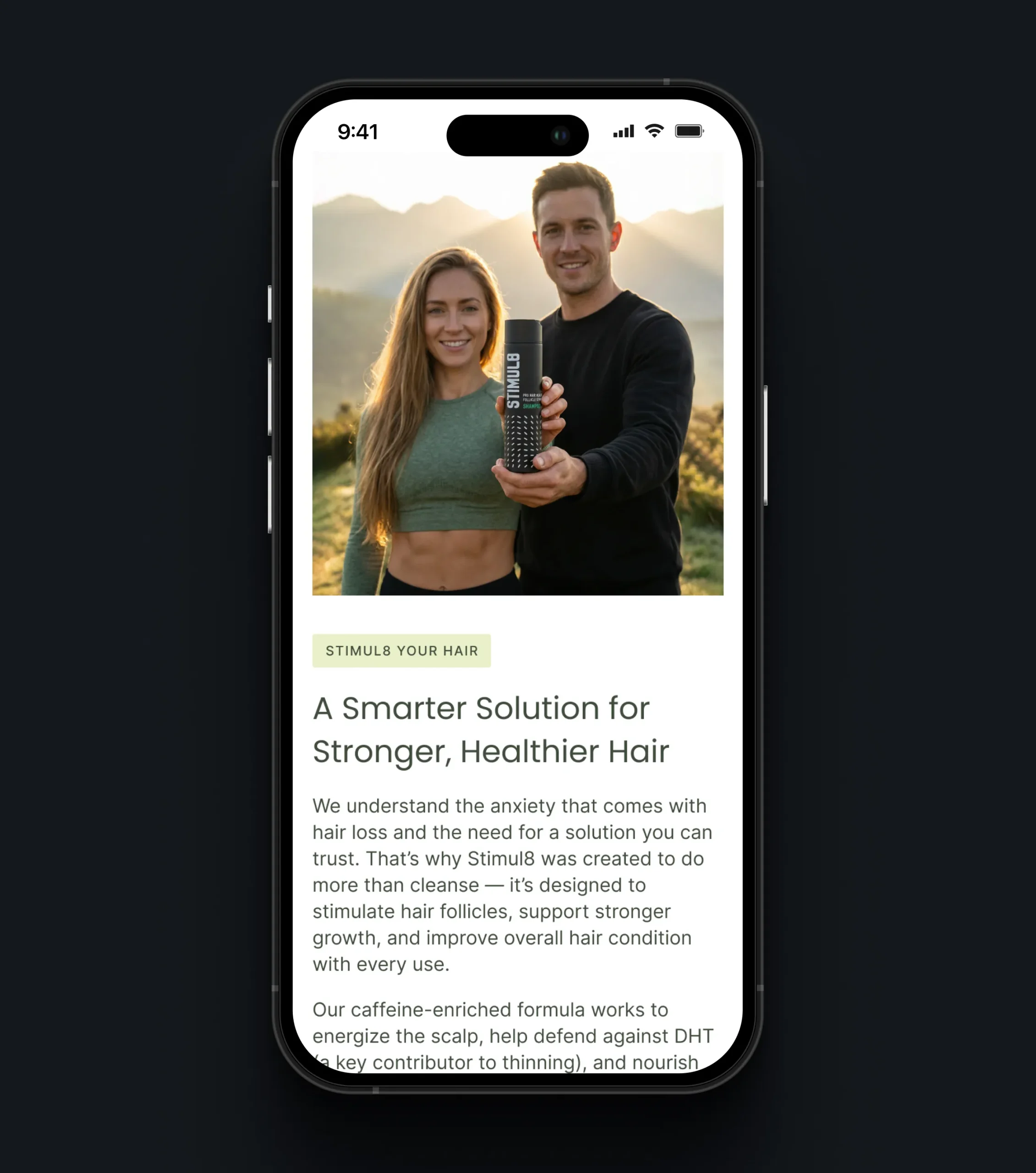
Responsive Mobile Experience
The mobile experience was treated as a priority from the start. Content was adapted for smaller screens, with clear messaging, intuitive navigation, and accessible calls to action to help visitors move smoothly from product discovery to checkout.
Amazon A+ Content
A+ content turns a standard marketplace listing into a branded product page. It brings the website’s key arguments and visual identity to Amazon, helping the product stand out among competitors and giving shoppers more reasons to add it to their cart.
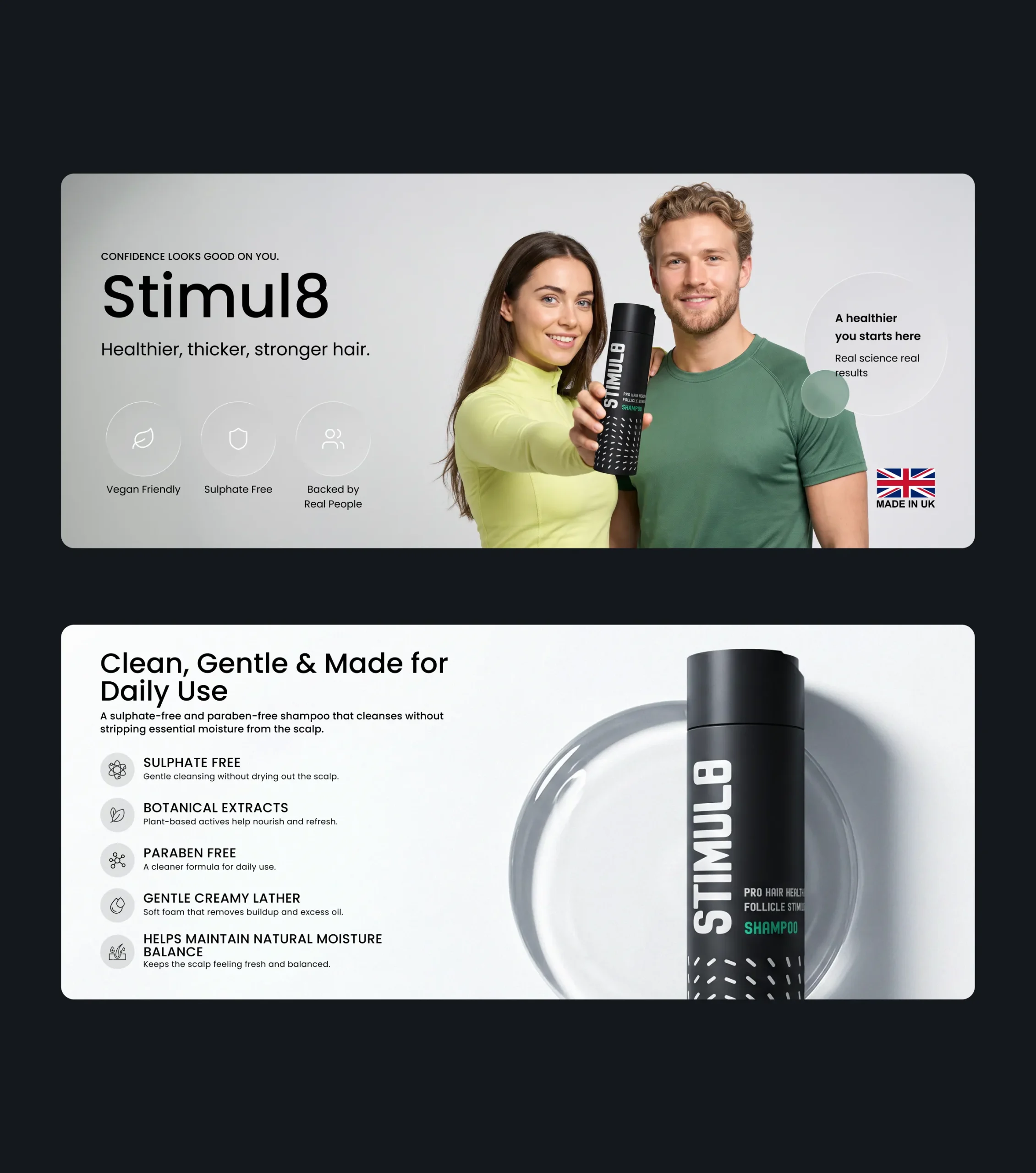
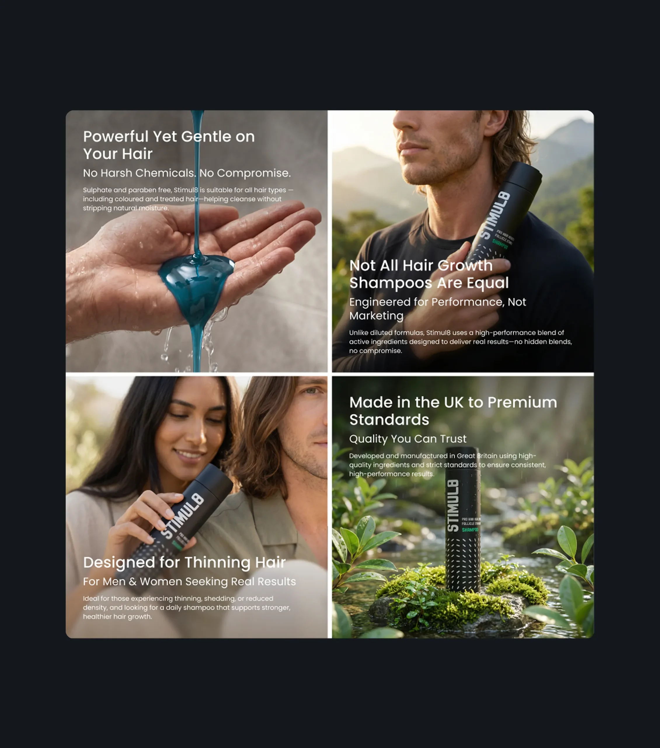
Amazon Product Creatives
Listing images are often the first and only content a marketplace shopper sees. Each creative focuses on one strong selling point, so the product’s value becomes clear within seconds of browsing - before the shopper even reads the description.
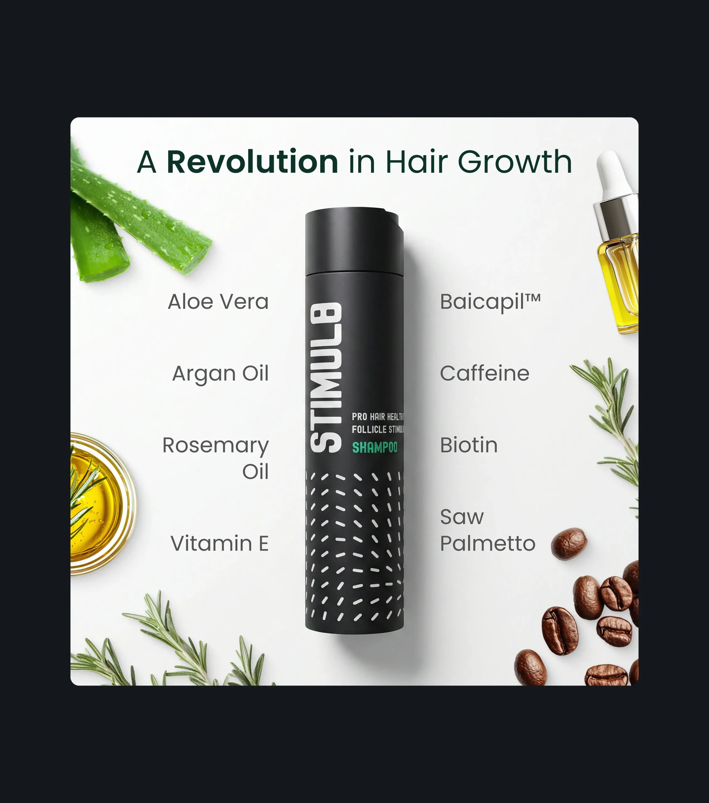
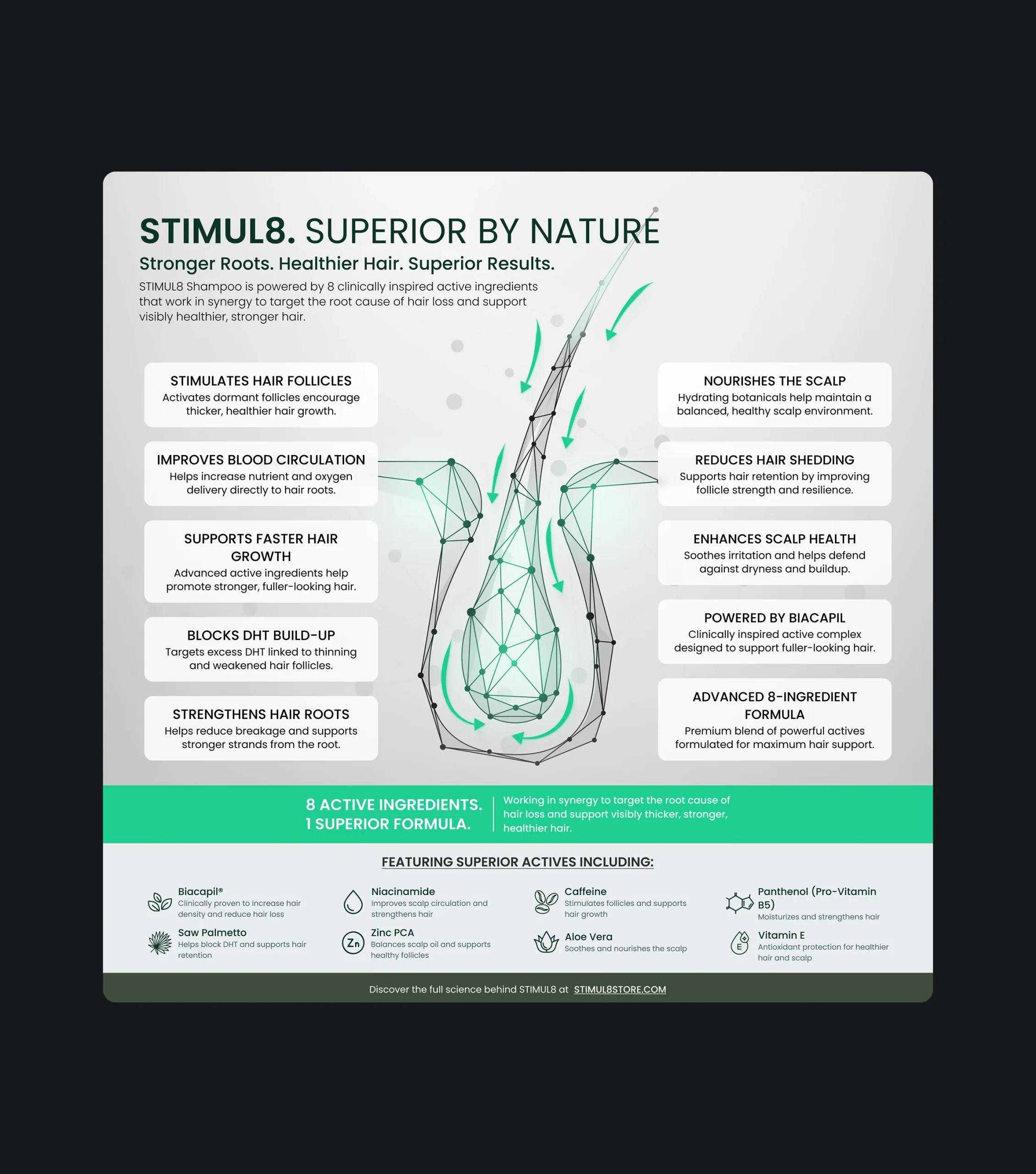
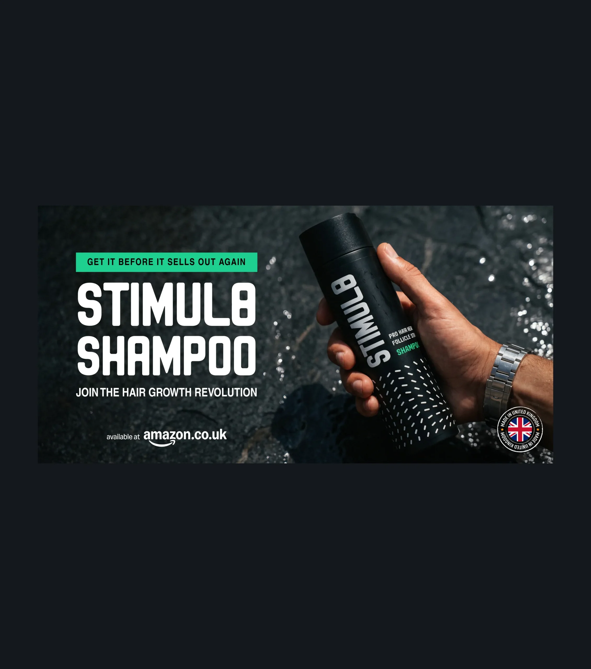
Promotional Banners
Promotional banners support campaigns and drive traffic back to the product. A consistent visual style and a single clear message make every banner instantly recognizable and focused on one action.
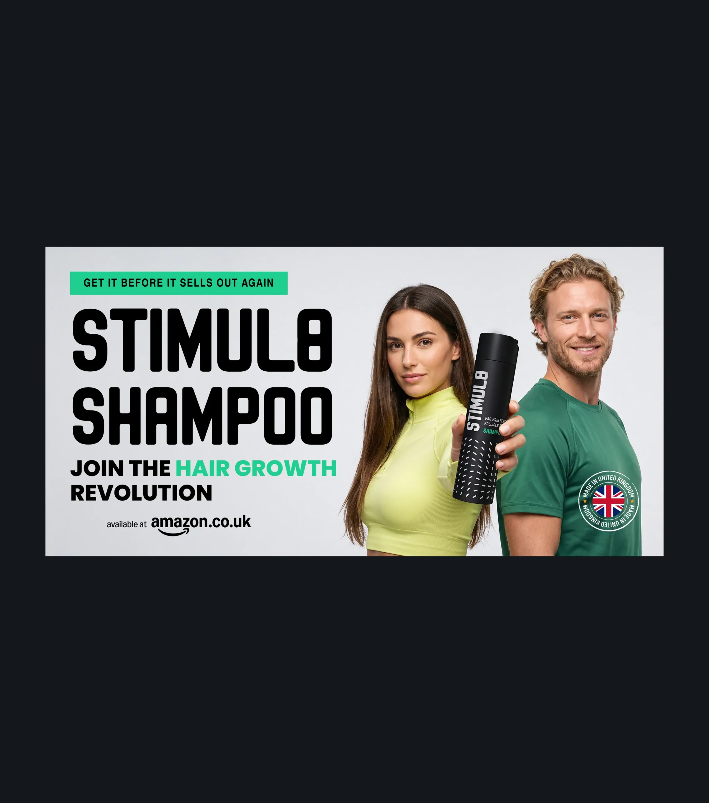
Print Advertising
Print ads extend the brand beyond digital channels and introduce the product to new audiences. They carry the same key arguments and visual language as the website and Amazon, so customers recognize the brand when they later look for it online.
Conclusion
For a product in a sensitive category, design has to do more than look premium - it has to earn trust and turn that trust into a purchase. The project gave a new hair care brand a complete sales experience built around how customers actually decide: a strong first impression, a clear explanation of how the formula works, proof from real users, and a product page designed to close the sale.
Beyond the website, the same arguments and visual identity were carried into Amazon A+ content, listing creatives, promotional banners, and print advertising, so the brand speaks with one voice wherever customers meet it. Every touchpoint answers the same
questions - what the product does, why it works, and why it can be trusted - and naturally leads to the next step.
The project brought together a conversion-focused website concept, Amazon creatives, promotional banners, and print advertising into one consistent brand experience. Each touchpoint was designed to communicate the product’s benefits clearly, build customer confidence, and support purchasing decisions across digital and offline channels.
More Cases












Your Next Step Starts Here
We don’t just analyze businesses - we uncover opportunities.